Browsing Tag

Guest Blogger

Design

Art Crush: Audrey Heller

April 26, 2013

Miniatures fascinate me. Maybe it’s because I watched the movie Honey, I Shrunk the Kids a lot when I was little. Or maybe it’s the fact that I’m 5’3″ and holding tiny things makes me feel like a giant… we’ll never know, but I do know this: Audrey Heller’s photographs are seriously crush-worthy.

Audrey transforms common foods and objects into exciting uncharted worlds for her tiny figurines to explore. Her playful and imaginative juxtapositions create some pretty surreal scenarios. Ordinary objects like grapes, cappuccinos, and breakfast cereal become unfamiliar – even dangerous – landscapes.

Like film stills, Audrey’s photos leave you wondering what came before the scene you’re looking at and, more importantly, what will happen to our tiny protagonists next. I’m a little worried about those scuba divers… I mean, how will they get out of that bowl? What if they get eaten? What happens when that shredded wheat gets soggy? Because you know it will…

Audrey is truly my favorite kind of artist – one who thinks outside the box and inspires us to do the same. You can’t help but use your imagination when looking at her photos. They make you think and that’s really what art should do, right?

Audrey Heller lives and works in her native San Francisco Bay Area. Since 1996, her photographs have been shown, shared, published, and collected around the world.

Get a peek inside Audrey’s studio here and learn more about the works featured above: Ripened, Cafe Society, Challenging Conditions, Bound, Fish Out of Water.

Design

Art Crush: Valerie Galloway

April 19, 2013

Happy Friday! Erin from artsocial here to talk about another uh-mazing artist from the Uncommon Artist Gallery, Valerie Galloway.

Guys, Valerie is speaking my language. I’m such a fan of interesting patterns and graphic elements like stripes and polka dots. Plus I studied French in college, so I’m definitely digging the Parisian je ne sais quoi in all of Valerie’s work.

Valerie finds inspiration from post-war Paris and old family photos, especially those of her French mother and aunt with fabulous hairdos from the 1960s. She’s also inspired by French New Wave cinema, old American TV shows from the ’60s and ’70s, and the movie Amadeus, which she says had a huge impact on her creative life.

Her inspiration is without a doubt captured in each work. The blushing maidens and femme fatales, the characteristically French sense of fashion, and the mile-high patterned bouffants all carry the spirit of her influences… and that pink polka dot afro is just plain AWESOME, don’t you think? I can’t get over it.


And guess what? These prints of Valerie’s original watercolors are available exclusively at UncommonGoods. So check ’em out, mes amis! That empty wall in your living room? Yep, these prints would look so great there.

See more from Valerie in the Uncommon Artist Gallery and read more about the works featured above: Polka Dot Parisienne, Hello Gorgeous, Shocking Pink Afro, Lost at Sea

Design

Art Crush: Kate Lewis

April 12, 2013

Hello there! I’m so excited to be guest posting on The Goods. On artsocial I talk a lot about my art crushes. Well, let me tell you, the Uncommon Artist Gallery has some seriously crush-worthy artists. Like whoa. They need to be discussed. First up is Chicago artist, Kate Lewis.

Kate creates still-lifes of her sunny Victorian home using vibrant acrylics and watercolors. Like intimate portraits, her work captures the thoughtfully designed corners of her home and daily life. From bold patterns to vases overflowing with flowers to stacks of colorful books, Kate’s work proves beauty really is in the details.

Kate finds inspiration from design and fashion magazines, blogs, Pinterest, and from decorating her own home. Her beautifully constructed and colorful paintings mirror the trends in interior design we love so much. Unexpected colors and patterns? Yes, please.

Twinkle Twinkle (above) is definitely my favorite. It’s as if we’re guests at her effortlessly charming backyard party. I can almost hear the music and taste that watermelon! Delicious.

Kate captures the essence of what life at home should be. Calm and inviting spaces filled with fragrant bouquets, good books, and big comfy chairs. She makes me want to redecorate! I should at least start buying more fresh flowers… OR I could get one of Kate’s paintings. Art is way better than flowers, don’t you think?

The Uncommon Life

DIY Project to Welcome Baby by Rubyellen of My Cakies

July 30, 2012
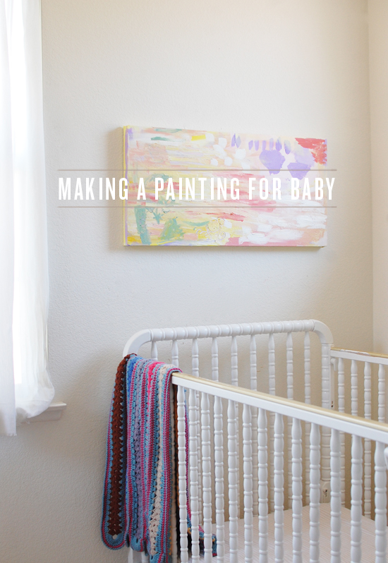
baby artbaby artbaby artbaby artbaby artbaby artbaby artbaby art
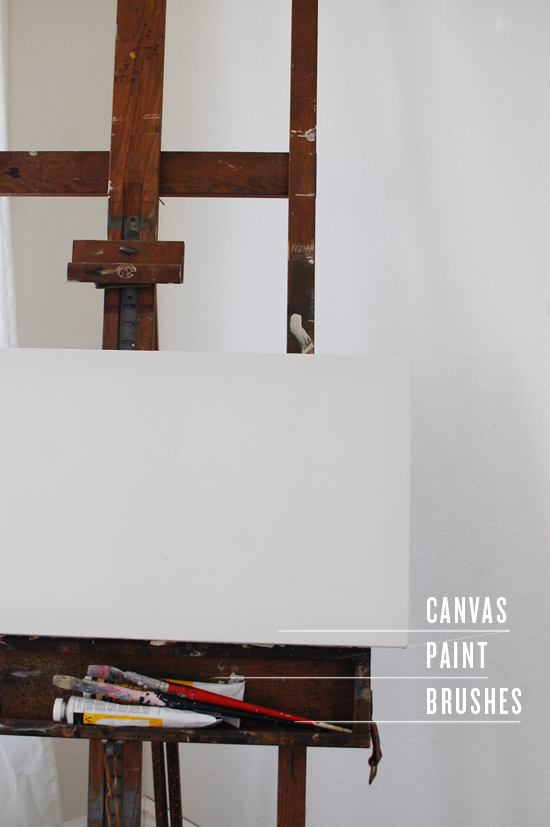
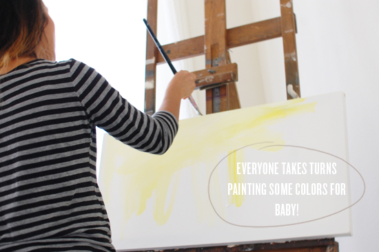
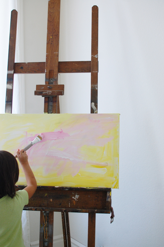
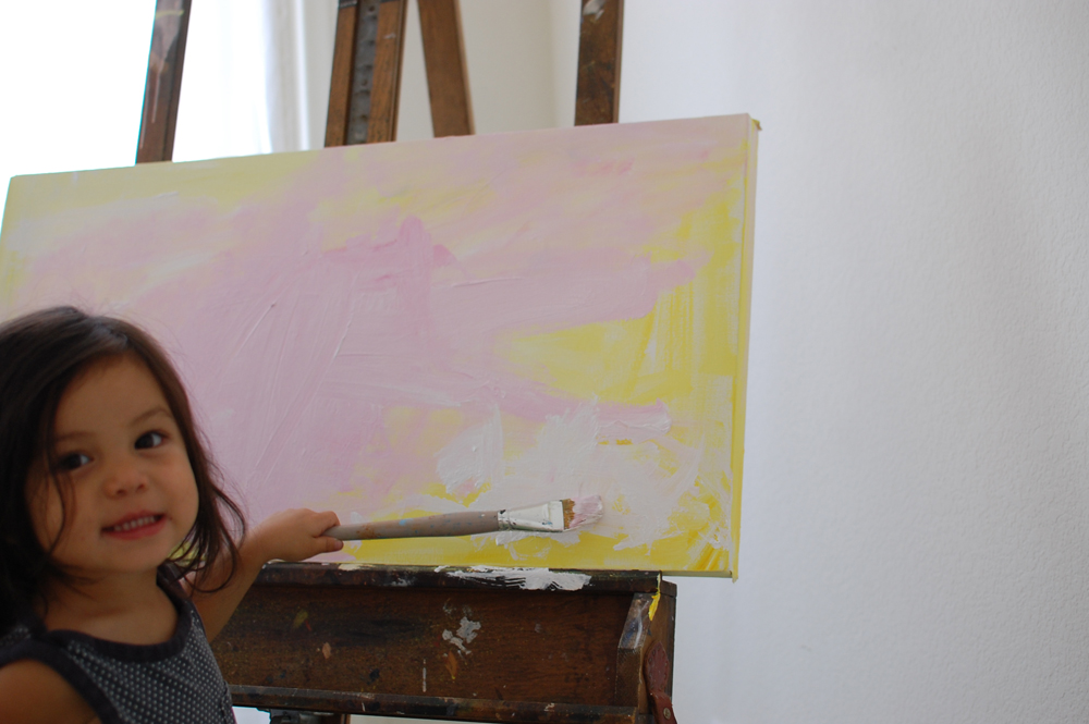
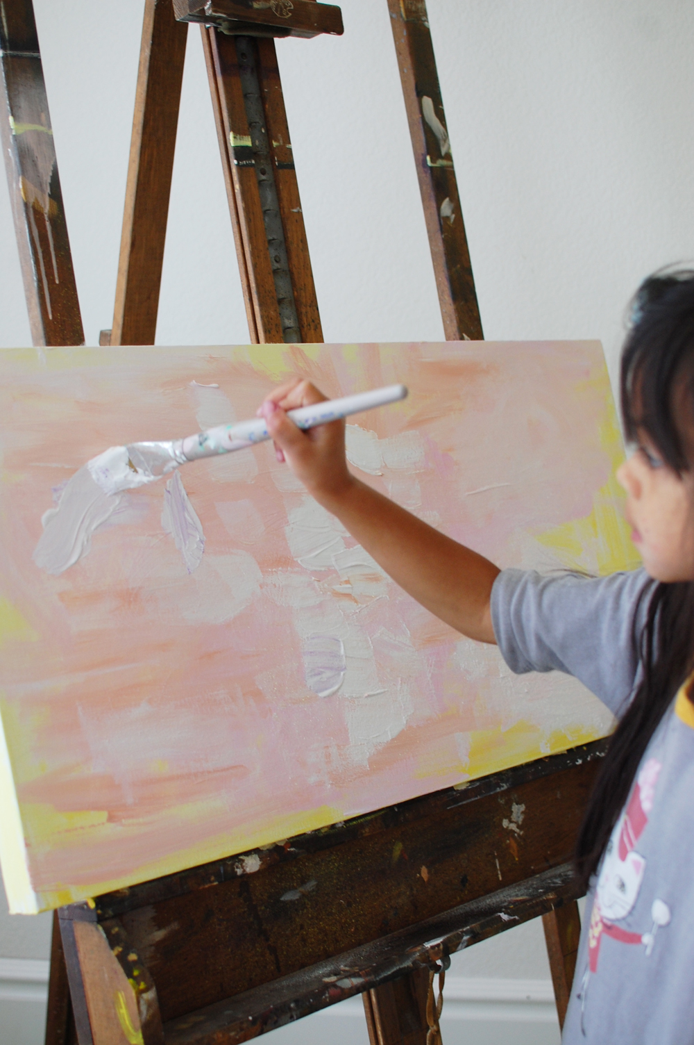
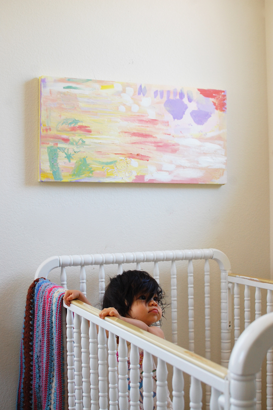
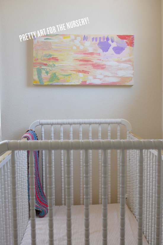
Collaborative family projects are the best. We first did a family art piece (see here) before Soul was born and now we finally got around to creating one for Glow. I asked the girls what colors come to mind when they think of their baby sister and those are the colors we used. All of us took turns painting on it and we went back a few times to let layers dry before adding more. It’s a sweet pop of color perfect for a baby room! 

We loved Rubyellen’s idea of coming together before a new baby is born and creating a piece that is unique and memorable from the entire family. It not only can serve as a personalized piece of art but a special keepsake for the rest of their life! Visit Rubyellen’s blog, My Cakies, to learn more about her incredible family and check out her hand-picked collection of UncommonGoods baby gifts.

Gift Guides

Wedding Decor Picks from Maggie of Rustic Wedding Chic

June 8, 2012

As the founder and editor of Rustic Wedding Chic I constantly hear from brides who are looking for fun, upbeat and unique items to add into their wedding decor. Trying to find the best wedding decor items is no easy task which is why I took the time to collect a few of my favorite uncommon wedding goods.

Squirelly Love
Perfect for a cake topper for a rustic wedding or I think this cute little item would look great on the head table or your sweetheart table right in front of you and your new spouse.

Ceramic Love Vase
A perfect vase to have on your special tables such as your cake table, guestbook table or line a few up along the place card display.

Bucket of Joy & Love
The name says it all. On your wedding day you should be filled with joy and love so why not showcase how you feel with these cute vases which would be really cute carried by your flower girls.

Family Tree Picture Frame
A wedding is all about merging two families together so why not showoff your new family tree. This would be really cute displayed for your guest to see as they eneter your wedding reception.

USA Scratch Map
How great would it be to have this fun map up next to your guestbook with a little sign that ask your guest to scratch off the state where they are from. This would be a fun way to see where all of your guest have travel from.

Lovebirds
Another great looking wood sculpture that could easily be used as a cake topper or just fun to have around on your wedding tables. This item would be super cute located close to welcome signs.

Mango Wood Bowl with Bark
The wood bowl makes for the perfect place to display items at your wedding. I used a similar style bowl to hold personalized napkins at my wedding or this would be a great ring bearer bowl.

State Pillows
Showcase the state where you and your spouse come from by displaying these state pillows at your wedding. At my own wedding I had a CT pillow placed on my chair and a NH pillow placed on my husband chair at our wedding reception.

Sustainable Picnic Plates & Cups
Having an outdoor wedding or rehearsal dinner often means searching for cute paper dining products. These picnic plates are super cute and eco-friendly.

Calla Lilly Drinkware Set
Add some wildflowers to this pitcher and drinking glass set and you have an instant country chic wedding decor item.

Moss Terrarium Bottle
If you are searching for a unique centerpiece idea look no further then these moss terrariums. These bring not only a very tranquil feeling to your table but they bring an eco-friendly feel as well.

Place Card Stamp
Part DIY, part pre-made this place card stamp is the perfect project for a rustic bride. Pick out some great recycled paper or shipping tags and stamp away.

The Uncommon Life

DIY Bridal Survival Kit

June 8, 2012

Hello Uncommon Goods blog readers! I’m Laura from A Girl Who Makes. I am here to share an easy yet necessary wedding day survival kit with you. Wedding days are memorable and can also be hectic. A survival kit for brides and/or bridesmaids will be a helpful gift to keep everyone calm and prepared. I’ve put together a little survival kit of some much needed essentials, but these kits can be customized easily by the contents put in the box.

MATERIALS: Gift Tag Stamp Set, twine or string, hole punch, card stock, scissors, and a box to hold items for the kit.

STEP 1: Fill the box with the chosen essentials. I included tissues, stain remover, cotton swabs, mints, bandages and some lip gloss.

STEP 2: Using the stamp set, ink the stamp and press it onto the card stock, making sure to have full coverage on the stamp. Press evenly when the stamp is on the ink pad as well as when the stamp is on the card stock. When lifting the stamp, be sure to lift straight up so you don’t smudge the paper.

STEP 3: Trim the gift tag using scissors to the size you would like. Also using a hole punch, make a hole in the tag as well.

STEP 4: Using the pencil from the Gift Tag Stamp Set, fill out the tag.

STEP 5: Take a piece of twine or string that measures about 1 yard and wrap it around the box several times. String the tag onto the twine and tie in a bow to complete the box.

The Uncommon Life

How To Repot Succulents

June 8, 2012

In the world of trends, Succulent plants seem to be taking home the crown in the fauna and flora category. And why shouldn’t they? Succulents are hardy, unique, and perfect for the dry summer heat. They don’t ask for much, but a good environment No green thumb needed — follow this quick DIY tutorial to repot your succulents and ready for your front porch or city window.

As Charlotte (you know, the one with the web) would say, Salutations! I’m Blair – the bloggin’ gal from the lifestyle and fashion blog, Wild and Precious and now that I’ve introduced myself lets chat about a way to spruce up that patio of yours!

Mix Your Potting Soil

Potting soil recipe:

  • Potting Soil
  • Coffee Grinds
  • Sand

Did you make mudpies growing up? If so, this might be your favorite part — make your own dirt mixture! When picking out potting soil just get the very most basic stuff. You don’t want anything too rich in additives — Succulents just don’t like that stuff. The goal of your dirt mixture is to get water/food/light/nutrients to and away from the roots in a time appropriate fashion. Mix coffee grinds and a little sand into your dirt before filling your pots. The sand will keep your soil from getting too over saturated with moisture (remember, these type of plants are desert dwellers – they aren’t use to a whole lot of the wet stuff) and the coffee grinds will help fertilize as well as keep away slugs and bugs that would otherwise love to nibble your Succulents down to nothingness.


Prepare Your Pot

As far as picking out pots the world is your oyster. You don’t need anything too big and can even choose to put more than one succulent together in a pot. With your pot(s) picked out fill 1/3 of each pot with sand. Do not try to cut costs (sand is cheap anyway) by bringing home sand from your beach vacation — that stuff is full of salt and your succulents will no longer be… well, succulent. Sand is important in helping move around and drain water. Once you’ve got the sand in, fill with your dirt mixture leaving a small lip of space up top.

Prepare Your Succulent

Before introducing your plants to their new home give the bottom of the existing dirts/roots a bit of a scrunch. Flare the root structure out a bit. This will help it transition better into its new/bigger/better environment. This is something good to remember when planting anything anywhere. If you don’t break up the bundle they are used to having in their temporary store shells, they might be a little too shy to branch out (pun intended) into their new world.

Pot Your Succulent

Now — where to put them? These guys are not fans of the midday sun. They prefer indirect/filtered sunlight and enjoy a nice airflow (I chose to put mine on my front porch which is roofed). As for watering — unlike planting in your garden, you do not want to water these right away after repotting. Give them some time to adjust and then give a good watering about once a week during the warmer months. Don’t ever leave standing water in your pots — it makes them angry.

Wham bam thank you ma’am we have ourselves some repotted Succulents! Call your self hip cause you’ve got the trendiest little plants on the block. Mischief managed!

Thanks for hanging out with me — pop over any time to say hi Wild & Precious. ta ta friends.

Ready to get started? Shop planters at UncommonGoods >>

The 10 Best Indoor Succulents | Indoor Plant Tips | UncommonGoods

Check out this INFOGRAPHIC to discover the perfect succulent for you. (No green thumb needed.)

Design

Moodboard Tutorial from Inspired to Share

May 21, 2012
image by Woodnote Photography


My name is Colleen and I am the creator of design and lifestyle Inspired to Share. I’ve been blogging for three years now and it has continually sparked my interest and desire to learn more about graphic design. I now find myself playing in Photoshop every day and I love experimenting in design to create original blog content. One of my favorite posts to create is a mood board. Lately, every Monday I’ve been posting a “Monday Mood Board” blog post as a way to share inspiration that I’ve discovered around the web. Mood boards are a great way to do more than just look at inspiration, but to really make it your own. I also find they can help with developing projects and concepts. I don’t know about you, but I spend a lot of time on Pinterest. Sometimes I want to look at multiple pins of images at the same time, so that I can see them all together. Or maybe I want to show my own interpretation of the images. For example, say I’m creating a concept for a new style post, a mood board can help serve to refine my ideas and vision. I like to gather inspiration everywhere, including everything from art, interiors, photography, styling to design and typography. Mood boards bring all of these areas together while formulating my overall aesthetic and color scheme. It’s really quite fun! Plus, I know I love looking at others’ designed mood boards, and they always inspire in new ways.

So now that you know why mood boards are so great, let’s create one!

1. The very first step is also the longest: selecting inspiration photos for the mood board. I like to turn music on that inspires me (lately I’m obsessed with this website) while I look. There are endless sources of inspiration on the Internet, and I think we all could spend days looking for cool and creative finds! I usually peruse other blogs and Pinterest to look for photos that catch my eye, doing my best to hunt down the original sources. I usually select anywhere from 5-10 photos.

2. Next, drag all the photos into Photoshop and put them on one canvas. Simply dragging the photos from your browser into Photoshop saves the step of saving each individual file and reopening it in Photoshop! And putting them on one canvas begins the process of designing the images together. I’ve found it’s helpful to work on a square canvas in Photoshop so that I don’t feel confined to the narrow dimensions for my blog.

3. Begin to arrange the photos and create your own layout. One technique I recommend is to fit images inside shapes according to the size and area you need to fill. That way you can fit all of the photos even if they don’t match the exact dimensions of your canvas.The options are endless. You can add borders, numbers, shapes, textures, type, and writing or drawing (I like to use my Wacom tablet!). This is the fun part! Be creative and have fun with it. There are no rules! Below are some screen shots of my mood boards in progress.

4. If you decide to share your mood board anywhere online, make sure you credit the original photo sources and link to where you found each image. This is an important step not to be overlooked! I try to find the original source of all photos, if possible (Pinterest doesn’t count!). Original sources so helpful when reading other blogs and it’s important to give credit where credit is due.
I always try to add a little something new in my designs to keep it fresh. Below is an example of a finished mood board that I made recently.


(sources: art by Andrew Bannecker, design by Nick Tibbetts, typewriter from joe vintage, photo via mr. serio, sfgirlbybay’s home by bonnie tsang, sign by Rizon Parein)

I hope you’re inspired to make your own mood board! I’d love to hear if you have any tips or tricks as well.
A big thanks to UncommonGoods for having me! Now go get inspired! xo